What is responsive design?
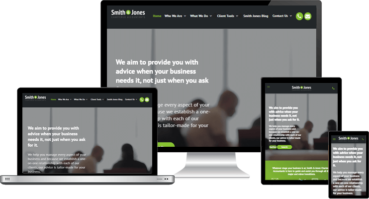
So... What is Responsive Design?
A responsive website will respond to the screen size of the device it is viewed on so instead of creating separate websites for various devices, your responsive website rearranges itself to fit the screen size its loaded on. This means clients and prospects will be able to access all of your website content and information from any device they are using.
Responsive design is also Googles preferred format for mobile friendly website so contributes towards your Search Engine Optimization ranking. A higher search engine ranking increases traffic to your site and enhances business growth and profitability.
Why you need a Responsive website
Your website is your most important online marketing and communication tool, so it is essential that clients and prospects get the best possible user experience from all of their devices. Internet usage on mobile devices has now overtaken desktop browsing as the most used digital platform.
To see examples of our clients responsive sites in action, visit our Customised Portfolio page, or check out our Pre-designed options.
Interested in responsive design?
Contact us today to discuss how we can help you with a responsive website.


